A Second Look at Free Fonts
Free fonts have gone through a renaissance in the past year. First of all, their quality has increased dramatically. Generally, free fonts don’t have a good reputation. Often they are just copies of already established typefaces. But, I have to say, many of the new ones are looking really good. And now some of them come, fully formed, in multi-weight families.
Why Is Having Multiple Weights With Italics So Important?
To set body copy properly nowadays, I believe a font family requires more than the usual four variants (normal, italic, bold and bold italic). Other weights, such as light and extra bold, are essential for creating typographic contrast between your heading, subhead, captions, sidebars, and text.
Combining Typefaces? we recommend playing around with this online typography tool for pairing typefaces!
Free Fonts
Recently, companies like Adobe and Google have been commissioning fonts for their own projects and releasing them for free on the Web. Professional typeface designers have been getting involved as well, sharing complete font families on Google Fonts. This link will take you to their font page. Just enter the name of the typeface in the search window to save you scrolling through the long list.
The ones listed below are free fonts that even typography snobs would be happy to use. They are suitable for headlines as well as body copy, and they render well on screen and at small sizes.
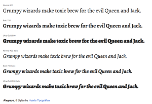
Alegreya
Alegreya is an award-winning serif typeface, available for free. Alegreya was designed with printed text in mind, but it is excellent to read on screen as well. The designer, Juan Pablo del Peral, claims that just as much care and attention to detail was spent on designing the italic as the roman and it definitely shows. He has also created a matching sans serif (which is also available on Google fonts).
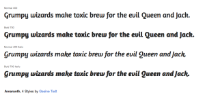
Amaranth
The Amaranth family is a friendly upright italic design with a slight contrast and distinctive curves. Designer Gesine Todt is a graphic designer and typefographer based in Berlin.
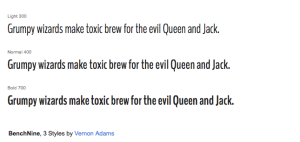
BenchNine
The quirky design of BenchNine is loosely based on the look of traditional woodcut type. Designed by Vernon Adams, this typeface should work well for headlines that want to stand out just a little from the crowd.
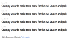
Cabin Condensed
This is the condensed set of styles in the Cabin font family; designed by Pablo Impallari. Cabin incorporates modern proportions and some elements of the geometric sans typefaces like Futrura.
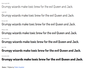
Dosis
Also designed by Pablo Impallari. Dosis is a rounded sans-serif type family. It started with the Extra Light style and grew to include 7 weights
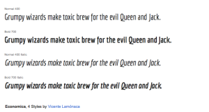
Economica
This typeface family was initially created for output on inkjet printers. Vicente Lamonaca collaborated with type design colleagues from all over Latin America in its design. It was inspired by the concept of saving space in publishing texts without loss of height. This means it is a very condensed type.
Josefin Slab
Josefin Slab is a slab serif typeface designed by Santiago Orozco. The design was inspired by geometric sans-serifs from the 1930s combined with more modern slab serif designs. The low x-height doesn’t make it the best for body copy, however it makes an excellent headline font.

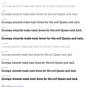
Lato
Originally, the Lato family was conceived as a set of corporate fonts for a large client — who in the end decided to go in different stylistic direction, so the family became available for public release.
Open Sans + Open Sans Condensed
Designed by well-known type designer Steve Matteson and commissioned by Google, Open Sans is one of the most widely used open-source fonts on the Web. It is used on many of Google’s redesigned pages. The light weight of Open Sans is especially nice.

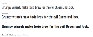
Oswald
Oswald is a reworking of the some classic Alternate Gothic sans serif typefaces. The letters have been re-drawn to better fit the pixel grid of standard digital screens. It was updated to include Light and Bold styles, and new tighter spacing and kerning. It works well as a headline.
Playfair Display
Playfair Display is a high-contrast serif designed by Claus Eggers Sørensen primarily for titles and headings. For longer stretches of body copy, Playfair Display pairs very well with Georgia.

Raleway
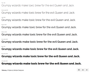
Raleway is an elegant sans-serif typeface perfect for body copy online. Initially designed by Matt McInerney as a single thin weight, it was expanded into a 9 weight family by Pablo Impallari.
Roboto + Roboto Condensed
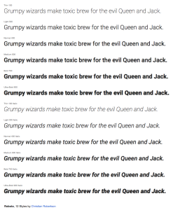
Roboto is like a blend of Helvetica, DIN and Myriad. The font works great on screen at different sizes and device resolutions. The font feels familiar, yet still possesses unique character the more you look at it. The Roboto family also includes a very nice slab version as well as a condensed version.
Source Sans Pro
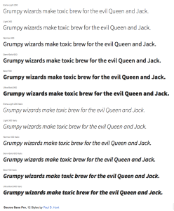
Source Sans Pro is Adobe’s first open-source font. Apparently, its designer, Paul D. Hunt, was inspired by early-20th-century gothics such as Franklin Gothic and News Gothic. Its intended use is for user interfaces so it renders very well at small sizes. The font is available in an impressive 6 weights, making it extremely versatile.
Titillium
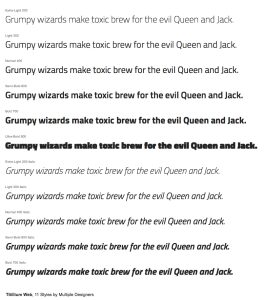
Titillium was a student project. Twelve students at the Accademia di Belle Art di Urbino collaborated in its design and it is still being updated. Very nice.
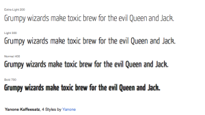
Yanone Kaffeesatz
Yanone Kaffeesatz was first published in 2004 and has been downloaded over 100,000 times to date. You can see Kaffeesatz on packaging around the world, on Dubai mall promos, and on New Zealand McDonalds ads.
Typography & Graphic Design Classes
Advance your professional typography skills from the pros, take basic to advanced classes including Illustrator, Indesign, Photoshop, Design Essentials and much more — taught in-person by industry leaders.
Check out The Training Company for all of our design school offerings!
Subscribe to the Training Company email newsletter for the latest pro tips and special offers.
